Explorer
Now that we are aware of the concepts that define Statful, let’s throw our hands on the brief and make visualisation happen.
Configuring a graphic takes a few steps, which you can follow through in order, or run just a few.
- Choose the metric to chart
- Aggregations, transformations and baseline
- Filter values (Tags)
- Configure visualisation
- Applying functions
- Enter the Widget’s name and Save your Work
In the following titles, we will look into each step in detail.
Choose the Metric to Chart
The Explorer allows you to play around with your graph settings, and experiment with the options that will help you empower your instrumentation. First off, start by selecting the Metric that you want to draw from the metric dropdown.
You can frame it with one of the predefined time intervals, or by applying a custom Timeline.
Aggregations, Transformations and Baseline
- If defined during Metrics Ingestion, the Aggregation option is available.
(Useful for when you have multiple endpoints,) you can choose the appropriate data granularity based on a given time range.
For more details, please see the Aggregations section of the documentation.
Another option is to take the retrieved data and apply a Transformation such as
Mean of the data point values over the Resolution periodorLast value of the data point received over the Resolution period.Last but not least, displaying additional series based on the original queried data series is possible by applying a defined time-shift such as a relative -1h, -1d, etc. or an absolute time-shift, by picking a specific date.
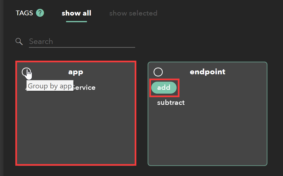
Filter Values (Tags)
You can aggregate your metrics across infrastructure by adding another layer of abstraction to your monitoring.
Simply put, tags are used to filter data points. Observe the same metrics in different dimensions by defining a pair tag/value during ingestion time (e.g. request/instance type).
Once the metric and visualisation are in place, click on the tag(s) you want to filter the data by, or Group by Tag as to chart the data series with all the values from that group.
The syntax of this value is referenced here.
Configure Visualisation
Statful allows to configure and style data on each graph with the following options:
Styles - Select from the available styles of charts such as Line, Stacked Line, Bar, Pie, Gauge and Big Number.
Axis - Set labels for axis, use custom scales, and apply other units or conversions to the displayed values.
Tooltip - Show the instant graph values in numerical or percentage values and display up to five decimal points on your results’ window.
Grids - Define whether the graphic should have x or y-grids displayed or even a custom guideline to highlight a significant threshold.
Applying Functions
Another option for analysing your data is to apply a custom transformation, that allows the preview of an expected impact.
The available functions are:
Mathematical: sum, sub, div, mul, exp, rps, deriv. These modify the arithmetic values displayed on your graph.
Filter: removeAboveVal, removeBelowVal. These draw the metrics that match the filter expression.
Save your Work
After you’re done, you will need to add a title to the working Widget so that you can easily identify him from a set of Widgets on a new Dashboard.
If you press Done to close the editor, a warning will read that you need to Enter a Widget Name.
You can always come back to edit that graph from the Dashboards or the Entities menu.
Cancel if you don’t need to save changes.